March Magic: Fresh Jewelry Packaging Ideas to Welcome Spring

As the frost of winter melts away and the first blossoms of spring begin to bloom, it’s the perfect time to refresh your jewelry packaging to reflect the season’s vibrant energy. March brings new beginnings, fresh colors, and a sense of renewal—why not extend that magic to your packaging? Whether you’re a jewelry brand or a small business owner, updating your packaging can enhance your brand’s appeal and leave a lasting impression on customers.

1. Embrace Soft Pastels and Earthy Tones

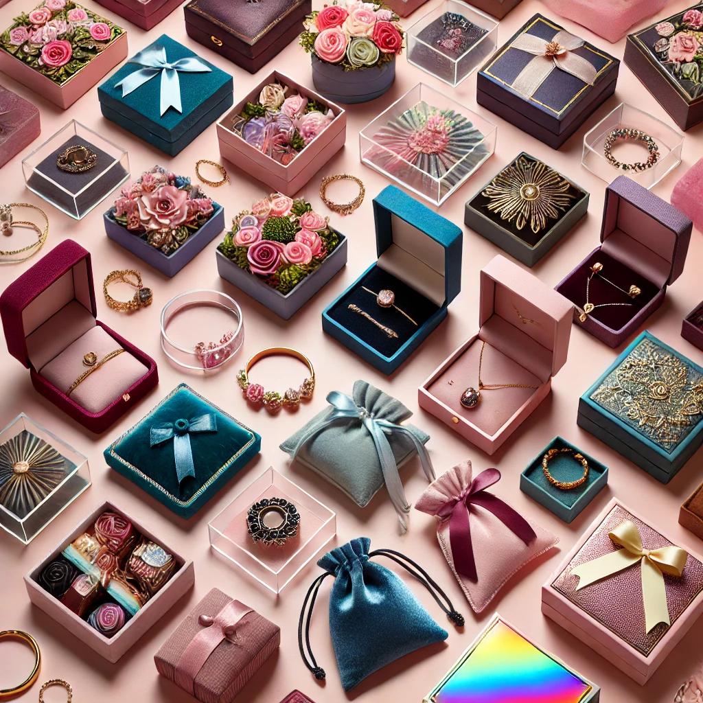
Spring is all about soft hues like blush pink, lavender, mint green, and sky blue. Consider incorporating pastel-colored jewelry boxes, tissue paper, or ribbon accents. If you prefer a more natural aesthetic, earthy tones like beige, sage green, or warm terracotta can create a fresh and organic feel.

2. Floral and Botanical Prints

Nothing says “spring” like florals! Incorporate floral motifs in your jewelry packaging through printed wrapping paper, stickers, or custom-designed box interiors. You can also add a touch of elegance with pressed flowers inside packaging or as a part of your branding elements.

3. Eco-Friendly and Sustainable Materials

Spring represents renewal, making it a great time to embrace sustainable packaging. Opt for recyclable kraft boxes, reusable fabric pouches, or biodegradable packing materials. Not only will this appeal to eco-conscious customers, but it also aligns with the growing trend of sustainable business practices.

4. Light and Airy Packaging Styles

Swap out heavy or dark-colored packaging for something lighter and more breathable. Sheer organza pouches, minimalist cardstock boxes, or translucent wrapping elements can give your jewelry packaging a fresh and airy look that reflects the season’s essence.

5. Personalized Spring-Themed Touches

Make your packaging feel even more special with personalized details. Handwritten thank-you notes on floral stationery, wax seals in pastel shades, or spring-inspired charms can add a thoughtful and luxurious feel to your brand presentation.

6. Fresh Fragrance and Sensory Appeal

Enhance the unboxing experience by adding subtle scents like lavender, rose, or citrus to your packaging. This can be achieved by lightly perfuming tissue paper or including a dried flower sachet inside the jewelry box. A touch of fragrance creates a multi-sensory experience that customers will remember.

Final Thoughts

March is the perfect time to refresh your jewelry packaging with seasonal charm. Whether you incorporate pastels, floral patterns, or eco-friendly materials, these small details can enhance your brand’s aesthetic and create a memorable experience for your customers.

How Color Psychology Affects Jewelry Packaging and Branding

The Power of Color in Jewelry Branding

Color is one of the most powerful tools in branding, influencing emotions, perceptions, and purchasing decisions. In the jewelry industry, packaging plays a crucial role in conveying a brand’s identity and value. The right color choices can enhance the perceived luxury, exclusivity, and desirability of a piece. Understanding color psychology can help jewelry brands create packaging that resonates with their target audience and strengthens brand recognition.

Understanding Color Psychology in Jewelry Packaging

Each color evokes different emotions and associations. When used strategically, colors can influence how customers perceive and connect with a jewelry brand.

1. Black: Timeless Elegance & Luxury

  • Black symbolizes sophistication, exclusivity, and high-end luxury.
  • Often used by premium jewelry brands to create an air of mystery and refinement.
  • Works well for minimalist packaging with gold or silver accents.

2. White: Purity & Simplicity

  • Represents purity, simplicity, and sophistication.
  • Used to create a clean and modern aesthetic, often associated with bridal and fine jewelry.
  • Pairs beautifully with metallic or pastel accents for an elegant touch.

3. Gold & Silver: Prestige & Opulence

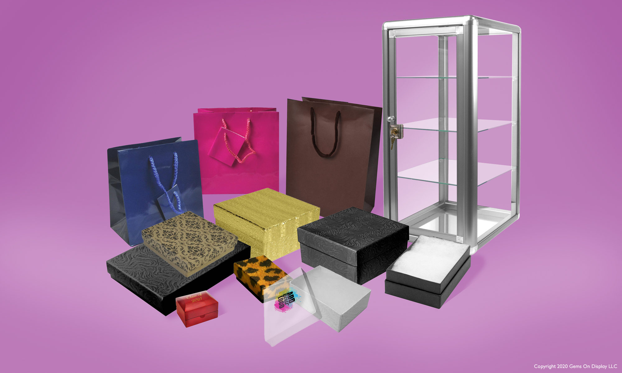
  • Gold exudes warmth, wealth, and tradition, making it ideal for luxury jewelry packaging.
  • Silver conveys modern elegance and versatility, suitable for contemporary brands.
  • Metallic finishes add a touch of glamour and elevate the perceived value of the product.

4. Red: Passion & Energy

  • Red is associated with love, passion, and excitement, making it a popular choice for romantic jewelry collections.
  • Creates a sense of urgency and attracts attention, often used in limited-edition packaging.
  • Deep reds like burgundy evoke a sense of sophistication and richness.

5. Blue: Trust & Serenity

  • Blue conveys trust, loyalty, and calmness, making it a great choice for reputable brands.
  • Dark blues exude professionalism and reliability, while lighter blues feel fresh and inviting.
  • Popular in packaging for gemstones like sapphire, aquamarine, and tanzanite.

6. Green: Sustainability & Nature

  • Green is associated with eco-friendliness, sustainability, and renewal.
  • Ideal for brands emphasizing ethical sourcing and environmentally friendly practices.
  • Dark greens suggest wealth and sophistication, while lighter greens feel fresh and organic.

7. Pink: Femininity & Romance

  • Soft pinks evoke sweetness, femininity, and charm, making them popular for delicate jewelry pieces.
  • Bold pinks feel playful and energetic, appealing to a younger audience.
  • Frequently used in packaging for engagement rings and sentimental jewelry.

8. Purple: Royalty & Creativity

  • Purple is often linked to luxury, spirituality, and creativity.
  • Deep purples feel regal and prestigious, while lavender tones feel gentle and soothing.
  • Ideal for brands looking to stand out with a unique, artistic appeal.

Choosing the Right Color for Your Jewelry Packaging

Selecting the best color for jewelry packaging depends on several factors:

  • Brand Identity: Align packaging colors with your brand’s values and aesthetic.
  • Target Audience: Consider the preferences and emotions of your ideal customers.
  • Jewelry Type: Match colors to the style and occasion of the jewelry (e.g., wedding jewelry in white, luxury items in black or gold).
  • Trends & Seasonality: Stay updated on color trends and adjust packaging for seasonal collections or special editions.

Final Thoughts

Color psychology plays a crucial role in jewelry branding and packaging. The right color choices can enhance the customer experience, elevate brand perception, and create lasting impressions. Whether you opt for classic black, elegant gold, or sustainable green, ensuring that your packaging aligns with your brand identity will set your jewelry apart and attract the right audience.

What colors best represent your jewelry brand? Share your thoughts in the comments below!