When it comes to displaying jewelry, choosing the right colors can make a significant difference in how pieces are perceived. The right background and lighting can enhance the brilliance, elegance, and overall appeal of jewelry, whether in a store, at an exhibition, or in photography. Here’s a guide to the best colors to use when showcasing different types of jewelry.
1. Classic Black – Timeless Elegance
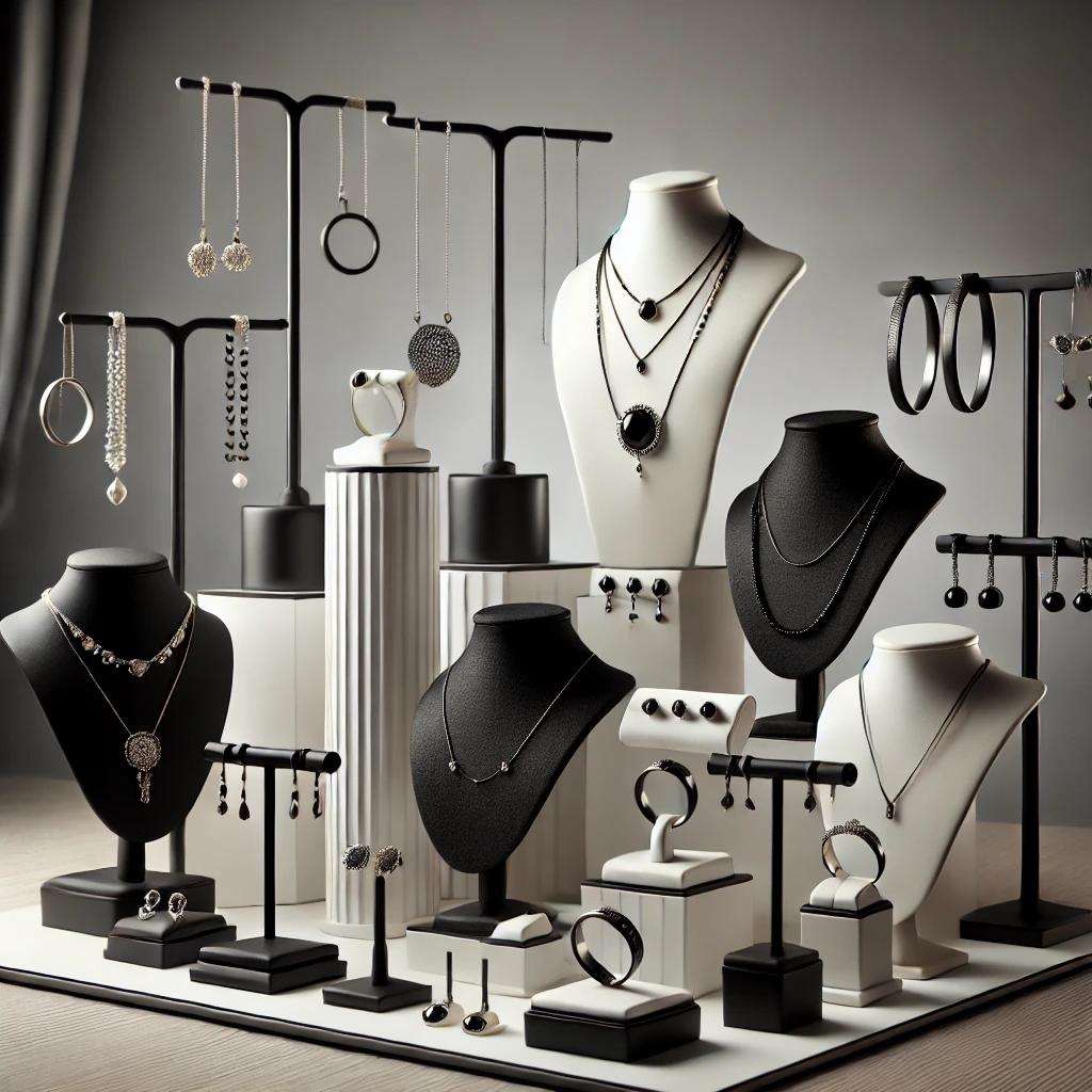
Black is a go-to choice for showcasing jewelry because it creates a stunning contrast, making diamonds and brightly colored gemstones pop. It exudes sophistication and ensures that the focus remains on the piece itself. Gold and silver jewelry both stand out against a black background, giving a luxurious and high-end feel.
2. White – A Neutral Canvas
White backgrounds are often used in jewelry photography because they provide a clean and distraction-free setting. This color works well for silver, platinum, and diamond jewelry, as it enhances their brilliance. However, for certain gemstones, white can sometimes wash out their colors, so it’s essential to consider the specific piece before using this backdrop.
3. Gray – A Soft, Subtle Contrast
Gray is a great compromise between black and white. It provides a neutral background that complements both light and dark metals, as well as various gemstones. A softer shade of gray can add a sophisticated touch without overpowering the jewelry.
4. Deep Blue – Enhancing Cool-Toned Jewelry
Deep blue backgrounds work exceptionally well with silver, platinum, and white gold jewelry. The cool tones of blue bring out the sparkle in diamonds and other transparent gemstones like sapphires and aquamarines. It also gives a regal and luxurious feel to the display.
5. Earthy Tones – Complementing Natural Gemstones
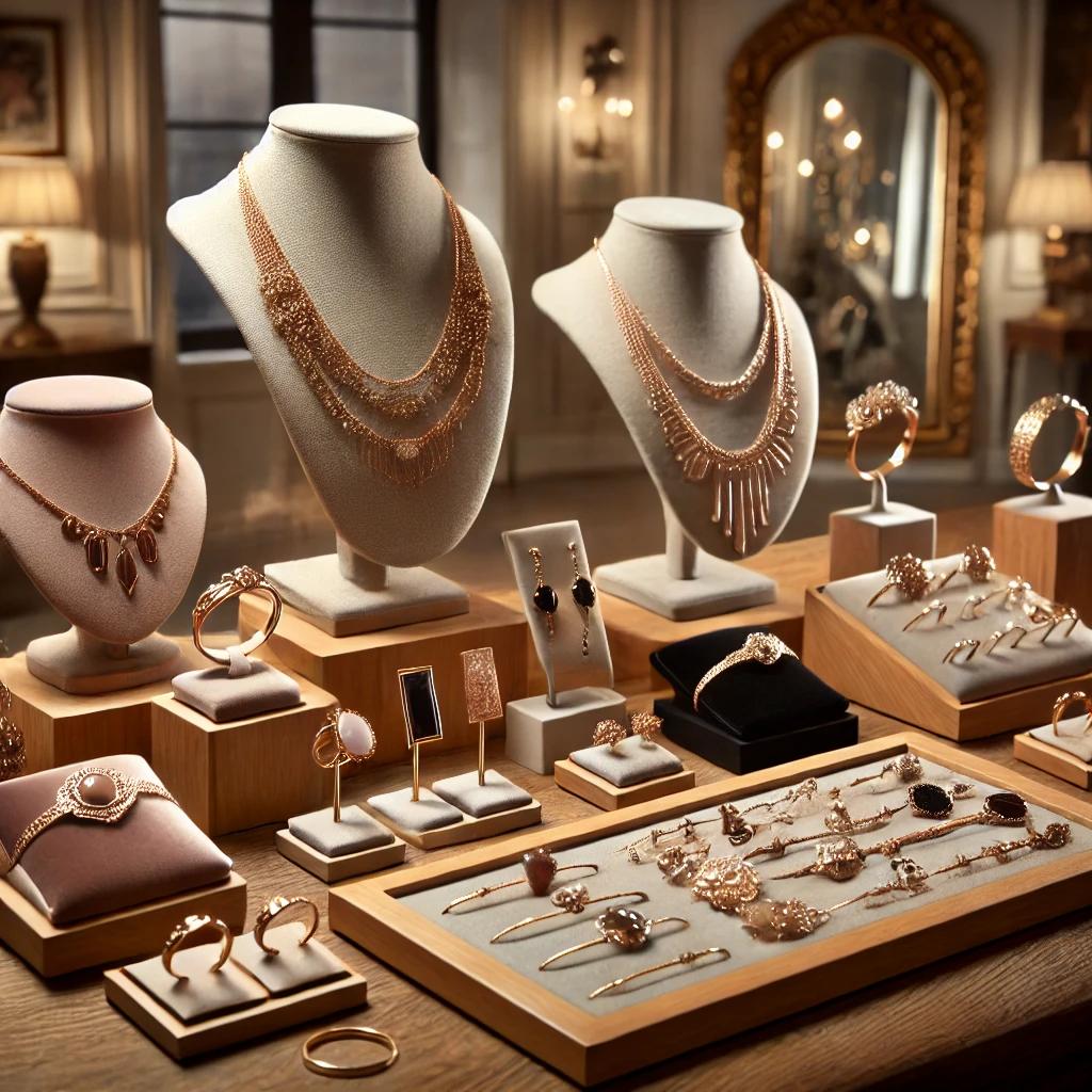
For jewelry featuring natural gemstones like emeralds, turquoise, or amber, earthy tones such as brown, beige, or forest green can be an excellent choice. These colors enhance the organic beauty of the stones and create a warm, inviting display.
6. Pastels – A Soft and Feminine Touch
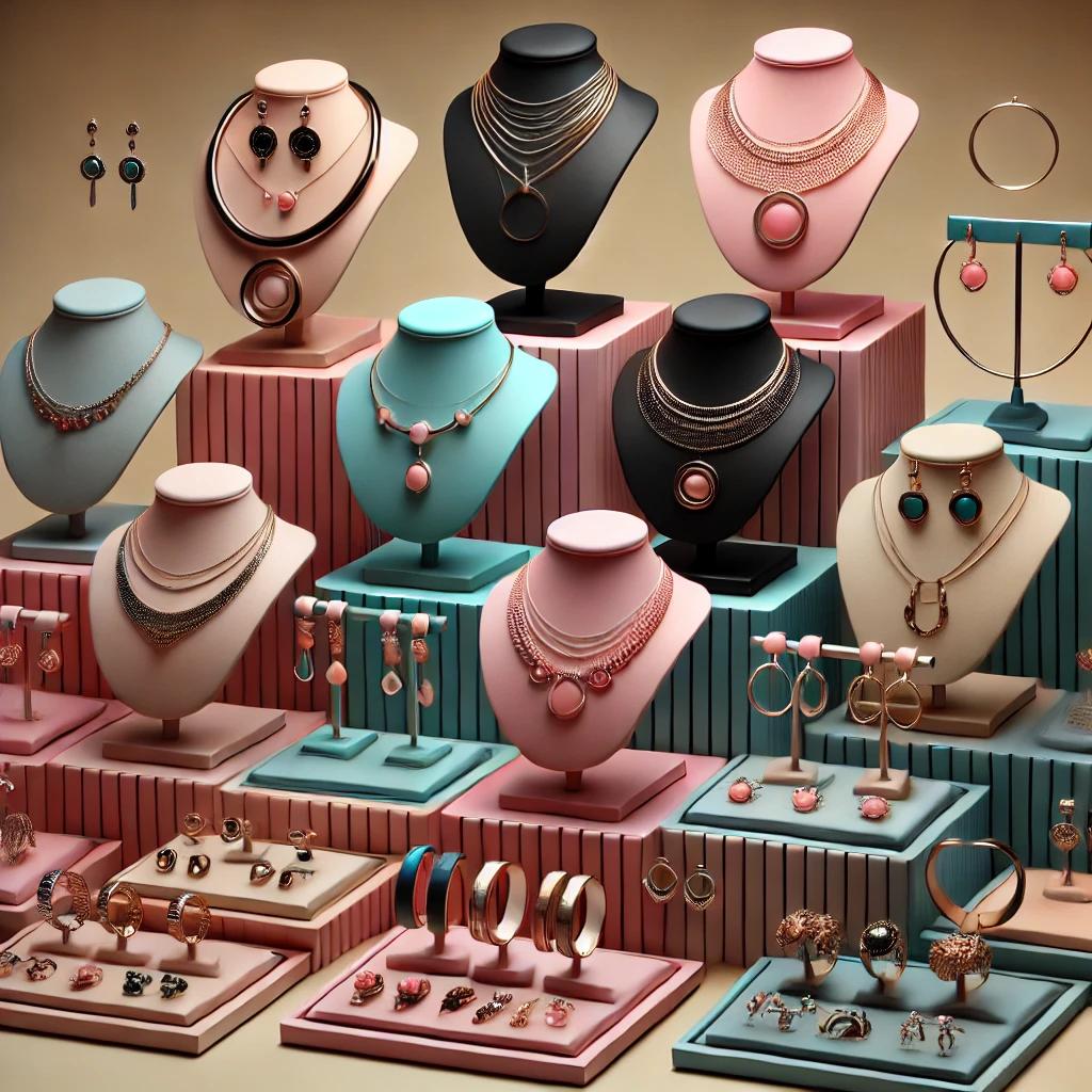
Soft pastel shades, such as blush pink, lavender, or powder blue, can work beautifully for delicate and romantic jewelry styles. Rose gold, pearls, and pastel-colored gemstones look especially elegant against these hues.
7. Red and Burgundy – A Bold Statement
For a dramatic and luxurious presentation, rich reds and burgundy backgrounds create a striking contrast with gold and diamond jewelry. These colors convey passion and elegance, making them ideal for high-end or vintage pieces.
8. Mirrored and Reflective Surfaces – Modern and Chic
Using reflective surfaces like glass or mirrors can add an extra dimension to jewelry displays. They enhance the sparkle of gemstones and metals by bouncing light around, making the pieces appear more radiant and dynamic.
Final Thoughts
The right color choice for displaying jewelry can elevate its appeal and captivate potential buyers or admirers. Whether opting for classic black, elegant gray, or vibrant jewel tones, it’s important to match the background with the type of jewelry being showcased. By understanding color theory and contrast, you can make every piece shine to its fullest potential.
