The Power of Color in Jewelry Branding
Color is one of the most powerful tools in branding, influencing emotions, perceptions, and purchasing decisions. In the jewelry industry, packaging plays a crucial role in conveying a brand’s identity and value. The right color choices can enhance the perceived luxury, exclusivity, and desirability of a piece. Understanding color psychology can help jewelry brands create packaging that resonates with their target audience and strengthens brand recognition.
Understanding Color Psychology in Jewelry Packaging
Each color evokes different emotions and associations. When used strategically, colors can influence how customers perceive and connect with a jewelry brand.
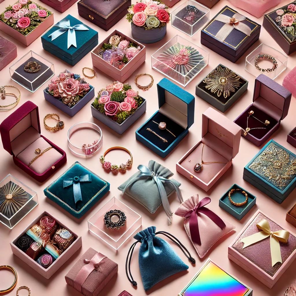
1. Black: Timeless Elegance & Luxury
- Black symbolizes sophistication, exclusivity, and high-end luxury.
- Often used by premium jewelry brands to create an air of mystery and refinement.
- Works well for minimalist packaging with gold or silver accents.
2. White: Purity & Simplicity
- Represents purity, simplicity, and sophistication.
- Used to create a clean and modern aesthetic, often associated with bridal and fine jewelry.
- Pairs beautifully with metallic or pastel accents for an elegant touch.
3. Gold & Silver: Prestige & Opulence
- Gold exudes warmth, wealth, and tradition, making it ideal for luxury jewelry packaging.
- Silver conveys modern elegance and versatility, suitable for contemporary brands.
- Metallic finishes add a touch of glamour and elevate the perceived value of the product.
4. Red: Passion & Energy
- Red is associated with love, passion, and excitement, making it a popular choice for romantic jewelry collections.
- Creates a sense of urgency and attracts attention, often used in limited-edition packaging.
- Deep reds like burgundy evoke a sense of sophistication and richness.
5. Blue: Trust & Serenity
- Blue conveys trust, loyalty, and calmness, making it a great choice for reputable brands.
- Dark blues exude professionalism and reliability, while lighter blues feel fresh and inviting.
- Popular in packaging for gemstones like sapphire, aquamarine, and tanzanite.
6. Green: Sustainability & Nature
- Green is associated with eco-friendliness, sustainability, and renewal.
- Ideal for brands emphasizing ethical sourcing and environmentally friendly practices.
- Dark greens suggest wealth and sophistication, while lighter greens feel fresh and organic.
7. Pink: Femininity & Romance
- Soft pinks evoke sweetness, femininity, and charm, making them popular for delicate jewelry pieces.
- Bold pinks feel playful and energetic, appealing to a younger audience.
- Frequently used in packaging for engagement rings and sentimental jewelry.
8. Purple: Royalty & Creativity
- Purple is often linked to luxury, spirituality, and creativity.
- Deep purples feel regal and prestigious, while lavender tones feel gentle and soothing.
- Ideal for brands looking to stand out with a unique, artistic appeal.
Choosing the Right Color for Your Jewelry Packaging
Selecting the best color for jewelry packaging depends on several factors:
- Brand Identity: Align packaging colors with your brand’s values and aesthetic.
- Target Audience: Consider the preferences and emotions of your ideal customers.
- Jewelry Type: Match colors to the style and occasion of the jewelry (e.g., wedding jewelry in white, luxury items in black or gold).
- Trends & Seasonality: Stay updated on color trends and adjust packaging for seasonal collections or special editions.
Final Thoughts
Color psychology plays a crucial role in jewelry branding and packaging. The right color choices can enhance the customer experience, elevate brand perception, and create lasting impressions. Whether you opt for classic black, elegant gold, or sustainable green, ensuring that your packaging aligns with your brand identity will set your jewelry apart and attract the right audience.
What colors best represent your jewelry brand? Share your thoughts in the comments below!