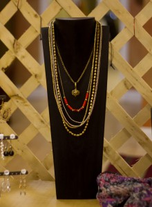
We canÔÇÖt get enough of this seasonÔÇÖs layering trend! HereÔÇÖs how to create a show-stopping display with this look.
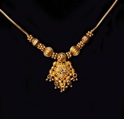
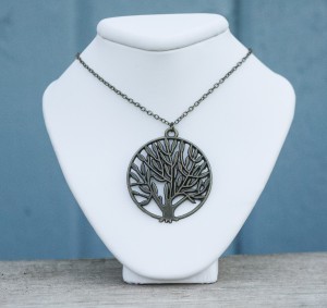
1. Start with a statement piece. This can be a gorgeous pendant, a locket, or even a chunky bead necklace. It should be slightly shorter than your other layers and be different enough from the others that it catches the eye. This is the focal point around which you will build the other necklaces.
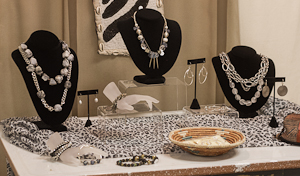
2. Add the remaining necklaces. These should be a mix of thin beaded necklaces or various chain necklaces. At least two of them should be the same length to give the look some width, and there should be at least two or three different lengths of necklaces for a complete layered look.
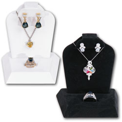
3. Tada! You have a beautiful layered necklace display. This type of necklace looks best on a tall display, such as our wood hand-carved necklace displays (shown above), or one of the 14ÔÇØ necklace busts.
Do you want more sales and wonder why they’re not coming in? There’s a chance you might be making your customers work too hard!
ItÔÇÖs no secret that people who are out shopping donÔÇÖt want to work hard at finding things. But are you doing all that you can to make things easy-as-can-be for your customers so that your sales will increase? Follow these simple tips to make buying so easy for your customers that they wonÔÇÖt be able to resist!
1. Keep your products at eye-level or lower. People donÔÇÖt like to look up more than they have to (or bend too far over, for that matter). It might sound silly, but watch your behavior the next time youÔÇÖre browsing through a store or booth, we bet youÔÇÖll find yourself looking at the lower items more than the higher ones!
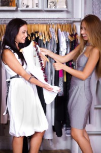
2. Display products in such a way that customers can try them on. If a customer can easily try a bracelet or ring on, theyÔÇÖre more likely to buy it because they become familiar with and attached to it as they wear it. This also cuts out the step of, ÔÇ£Hmm, would that bracelet look good on me? Would it match my style?ÔÇØ When your customers can see themselves in your products, they wonÔÇÖt have to do any guesswork about whether or not theyÔÇÖll like it. Design your displays so that customers feel comfortable enough to try something on if they like it, not as if theyÔÇÖre going to mess up your display if they touch something.
3. Pair matching or complementary products together. Again, donÔÇÖt make your customers have to look for matching earrings and necklaces, because they might not take that extra step. But if you do the work for them and display these items together, or suggest them while they are browsing, youÔÇÖre more likely to sell two or three items instead of one.
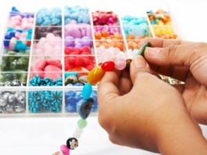
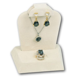
4. If you’re selling beads or gems, do your customers have to think about how to use your products, or are there examples in your display setup? If you’re selling gems, show customers how they’ll look when set in a ring or necklace. If you’re selling beads, show customers example of bracelets, necklaces, and earrings that can be made with your beads! This will help them envision the things they will be able to create with your product and make them want it.
What things have you found that make for smooth sales?
Without sales, it’s impossible to have a successful business. We’ve compiled a list of 7 tips for effective selling that will make the shopping experience better for your customers while making your life easier! What are your tips for great sales and happy customers?
1. Greet your customers when they walk into your store or up to your booth. A friendly smile and eye contact let them know you truly care about them. Even when itÔÇÖs been a frustrating day, stay positive!
2. Have a well-organized booth or store. Believe it or not, when customers arenÔÇÖt overwhelmed by too many products or extraneous things and are able to easily find what they want, theyÔÇÖre more likely to buy them.
3. Make certain products are clearly labeled with the price. Selling is a yes or no question, and if a customer canÔÇÖt find the price tag, their answer is far more likely to be “no”. Avoid an instant ÔÇ£noÔÇØ by performing the simple task of putting price tags on your products.
4. Not only is pricing important, but so are signs! Make things easy for your customers by using signs to direct them to key areas of your store or specific parts of your booth. Use signs as sales aids to show customers where to find things such as new products and special deals.
5. Attention to detail in your displays. Create displays that draw people in, paying attention to color choices, backgrounds, orientation, and other visual merchandising aspects. Product presentation matters! Arrange your items in an attractive, logical manner so that customers don’t have any trouble finding what they’re looking for.
Gems Tip: Try using jewelry trays and liners to keep items organized. And donÔÇÖt forget that trays arenÔÇÖt just for jewelry! They can be used to organize a whole range of items from ties to sunglasses (and much more).
6. Show them how to use your product. People like the experience of buying, and you can involve them in the process in a variety of ways. For example, do you sell beads? Have a display with a bead necklace on it so that customers can visualize how the beads will look around their neck. Are you going to an art show? Bring your jewelry making tools with you and work on something in your booth!
7. Listen to your customers. YouÔÇÖll learn a lot about what they want if you listen to what they say. After all, it’s important to remember that selling is all about giving people what they want. The easier it is for them to find what they want, the more you’re going to sell.
You donÔÇÖt ┬áneed to have an eye for color to be able to put together an eye-catching display!
There are a few simple guidelines to follow when dealing with the colors in your displays. Keep reading for a few quick color basics to keep in mind when youÔÇÖre putting together your booth, window display, jewelry displays, or even your packaging colors! The colors you use in your displays will help dictate your customersÔÇÖ moods, and influence them to buy (or not to buy), so itÔÇÖs worth spending some time learning about how to effectively use color in your displays.
1. Have a knowledgeable use of color. ItÔÇÖs important to remember that specific colors are associated with certain industries or holidays. Even if itÔÇÖs springtime and sunny, a combination of green and red is probably going to make your customers think about Christmas, so if thatÔÇÖs not your intention, itÔÇÖs probably not a good idea. An example of an industry that has a color associated with it would be the environmental industry. It is often paired with the color green, which (depending on the shade) can make customers think of things in terms of fresh, natural, and organic. Be aware┬áof choosing colors that match your intent, or at the very least, that do not cause an impression you never intended to create.
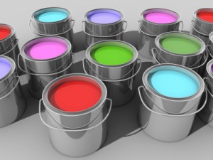
2. ┬áBright and warm colors are attention-grabbers, while cool colors are more soothing and calm. This certainly does not mean you should never use cool colors in your displays; can you imagine only brightly colored displays? It would overwhelm the eye and confuse the customer. Carefully placed splashes of color, however, draw the eye to key areas and products. Displays should also have a good balance of neutral tones to avoid overwhelming customers. ┬áAlso, if youÔÇÖre not looking to excite your customers (you might be going for elegance, subtlety, or calm), cool colors might be what you want to use.
3. Colors affect peopleÔÇÖs emotions. When choosing colors for your displays, think about what emotions you want to bring out in your customers. How do you want your customers to feel so that they are more likely to buy your products?
My Visual Merchandising has an excellent color chart that explains the emotions colors evoke, as well as how and when to use them. This article also explains various color schemes and how they work.
4. How about background colors?┬áThese are just as important as colors utilized in the front of a display! The background color is oftenÔÇöbut not alwaysÔÇöa neutral color (white, black, and beige are very popular, especially for jewelry displays), and should be an unequal blend of both warm and cool colors for the best effect. Although backgrounds should have a dominant color, when creating a booth or window display it can be good idea to have more than one color to avoid a dull background. Your background should push your products forward and not detract attention from them. For example, if you have red jewelry and a red background, your jewelry is likely to get lost in the background instead of standing out.
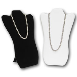
For a jewelry displays, if you have brightly colored jewelry, and you really want it to pop, a black or white display will help the jewelry to stand out.
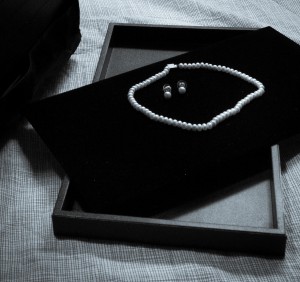
Notice the picture to the right and how different a white pearl necklace looks on the black and white backgrounds. It creates a different feel on each display!
If we were to place the pearl necklace on a beige display, the look would be different, too! The beige and white would give it a feeling of beauty and elegance since they are colors similar to the pearl necklace, while the black really makes the white pearl stand out and catch your eye since it is a darker color.
For some great examples of color in displays visit us on Pinterest! 
How is visual merchandising used to attract customers? Or, before we answer that question, what IS visual merchandising?Visual merchandising means creating an atmosphere in your store through displays, sensory messages, colors and lighting, product placement, floorplan, etc., that will attract customers and keep them interested. ItÔÇÖs about creating an environment that logically flows and is aesthetically pleasing at the same time; itÔÇÖs setting your store up in such a way that it generates more sales. Put differently, visual merchandising is the silent salesperson in your store that shows your customers where products are, how to use them, what to pair with them, and how theyÔÇÖll feel when they use them. It can be as simple and basic as the cleanliness of your store showing customers how much you care about having their business, or dig deeply into how they think and will respond to where product is placed on the shelf.
ItÔÇÖs important to give time to visual merchandising because not only has it been proven to increase sales, but also helps you build a customer interest and engagement. The easier it is for people to navigate your store and find what they want (or find things that are interesting), the more likely they are to buy something.
Since visual merchandising is a vast topic, weÔÇÖre going to break it down into a few posts to be able to go more in depth on these topics that are so vital to the retail world. To begin, here are a few key areas to focus on for effective visual merchandising:
1. Sensory messages. How does your store smell? What music do you have playing? WhatÔÇÖs the overall ÔÇ£feelÔÇØ of your store? Most importantly, are all of these things in line with what youÔÇÖre selling? For example, if youÔÇÖre selling elegant, high-end jewelry, chances are youÔÇÖre not going to have Hello Kitty posters on the wall, boisterous pop music playing in the background, or the scent of bubblegum in your store. However, if your product is jewelry for young teenage girls, it might be the sensory feel you need. Be careful to send your customers the right sensory messages!
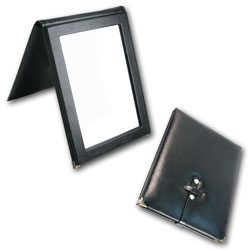
2. Show them how your products will look at home. Especially for jewelry or fashion stores, itÔÇÖs important for your customers to be able to see how theyÔÇÖll look in your products or how they will use them at home. Otherwise, why buy them? Use displays that accurately depict how a product is used or worn, keep mirrors handy for seeing items they try on, and make sure lighting is conducive to good viewing.
3. Change displays often. At a minimum, changing display themes every other month (6 main themes per year) is recommended. ┬áIf you can manage it, itÔÇÖs a good idea to switch displays around weekly (or monthly, if weekly is too daunting) so that customers will always be seeing something new when they enter your store. Seeing new products when they enter your store will keep them coming back to see what else you have to offer.
4. Clear focal points. DonÔÇÖt overwhelm or confuse your customers by having a display that doesnÔÇÖt have a clear focal point or any visual balance (especially in window displays!). If they are having to look all over to find the point of a display, they wonÔÇÖt stick around. WeÔÇÖve read that the average customer only views a display for 2-5 seconds. While this may not be true, it does give us an idea of how little time people spend looking at a display. If they canÔÇÖt figure it out what youÔÇÖre trying to convey very quickly, theyÔÇÖll move on to a display that does.
Traveling with jewelry can be a tricky thing. You probably spend enough time getting your jewelry ready to travel by carefully packing your pieces in jewelry trays and placing them in your carrying case, and you don’t want to spend more time re-arranging everything when you arrive. Guess what? You don’t need to! Rick shares an excellent travel show tip for how to keep your jewelry in place while you travel, so that when you arrive you’re able to pull it out (just as you left it) and start selling!
Tissue paper is a fabulous way to make gift packaging personal. All that crinkly tissue paper can be tricky to use in gift wrapping, but it doesn’t need to be! Let Tricia show you one way to use tissue paper to wrap a jewelry box and place it in a gift bag without getting the paper wrinkled (and without the frustration!).
CREATE a showcase display that will capture the interest of your customers while highlighting the unique qualities of your products with these three simple ideas for a great display case. It doesn’t have to be difficult to create a display that you (and your customers) will love.
1. Stick with basic colors, such as white or black. White tends to be the most popular choice for showcase displays because of it’s elegance and simplicity, but black can be a great option for lighter colored jewelry that you want to stand out.
2. Choose the appropriate height for displays. Since display cases dictate the height of your displays, you’ll want to choose display items that aren’t too tall. There are many displays that are created especially for display cases, such as showcase trays, or items like this mini necklace bust that still allow you to display necklaces without the height of a typical necklace bust.
3. Keep away from clutter! If you try to put too many things into a display case, your customers won’t know where to look or what to buy. An easy way to direct their attention to particular items is to utilize signs as┬ásales aids. A well-placed sign will catch the eye of your customer and pull it to the product you’d like them to focus on.
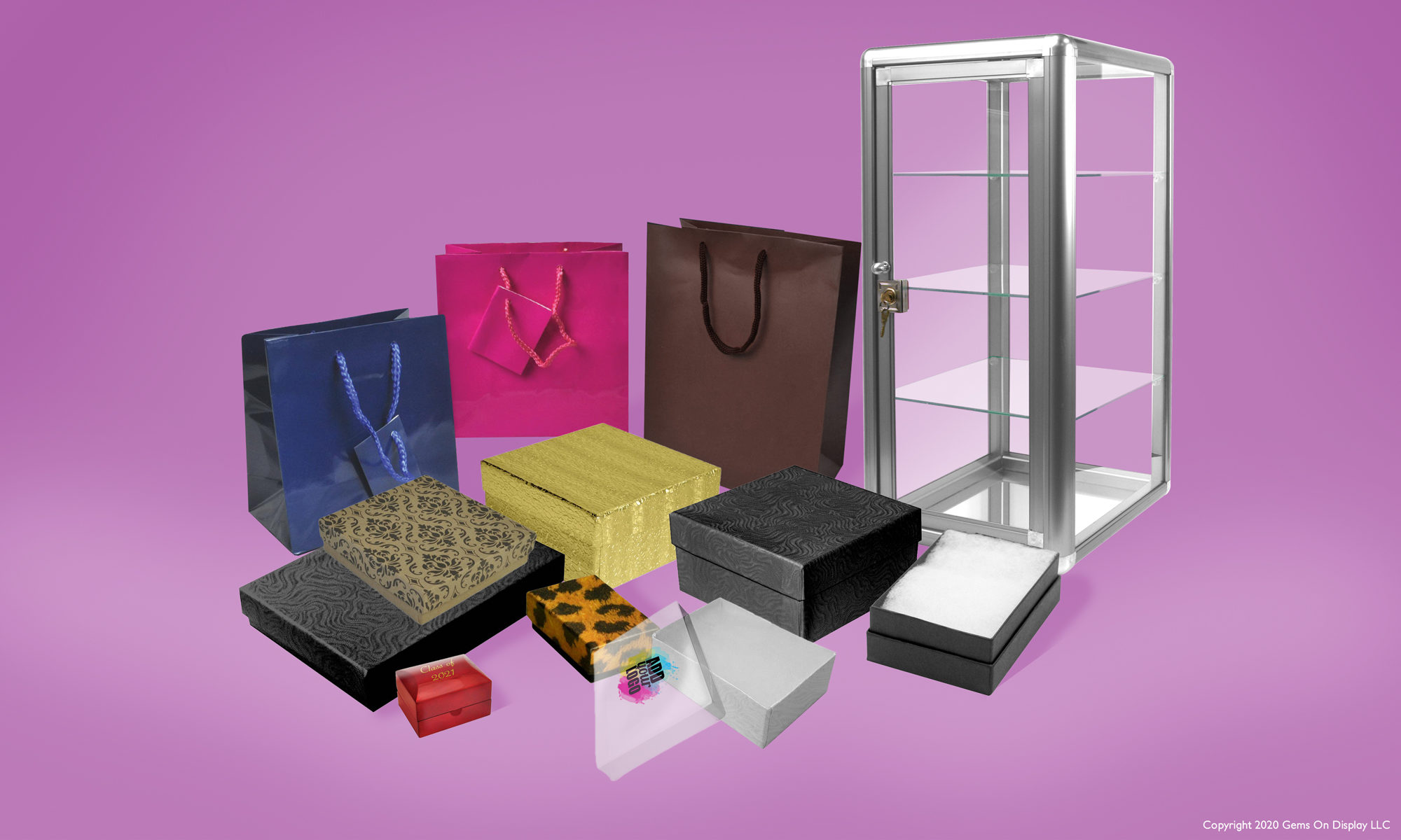
Do you know how easy it is to add your logo to your products with Gems?
Here’s how:
1. Go to www.gemsondisplay.com and find the products you love with the “add your logo” icon next to them. Any of these items can have your logo on them!
3. Our talented print tech, Jeff, will take your logo and make a mock up so that you can see how it’ll look. He’ll email it to you for your approval before moving forward.
4. Once he has your approval, he’ll make your printing plate (at NO extra charge!), carefully print your logo on the products you’ve selected, and then ship them off to you!
Could that be any easier?
P.S. But really, if you do have any questions at all, please give us a call at 419-830-3104 or email us at logo@gemsondisplay.com. We’d be so happy to help walk you through the process!